A website is used across various screen sizes, whether on desktop, tablet, or mobile. In this article, you’ll learn how to visualize these different sizes using the various builders we employ at Vetcelerator, as well as how to hide elements, images, or text that don’t fit the screen size.
Let’s start with Elementor:
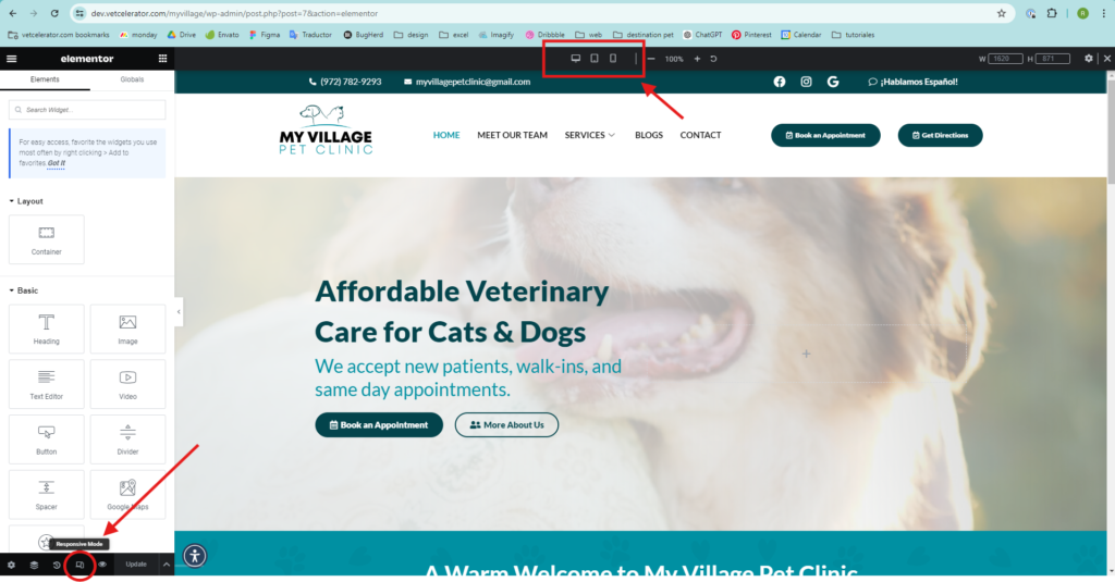
- In Elementor, screen sizes are found in the lower left corner. Click on the icon, and a tab will open at the top where you can choose the type of screen you want to use (desktop, tablet, or mobile).
For example, website headers often adapt to the device’s screen size. A header designed for a desktop, with more space, typically isn’t functional on a smaller mobile screen.
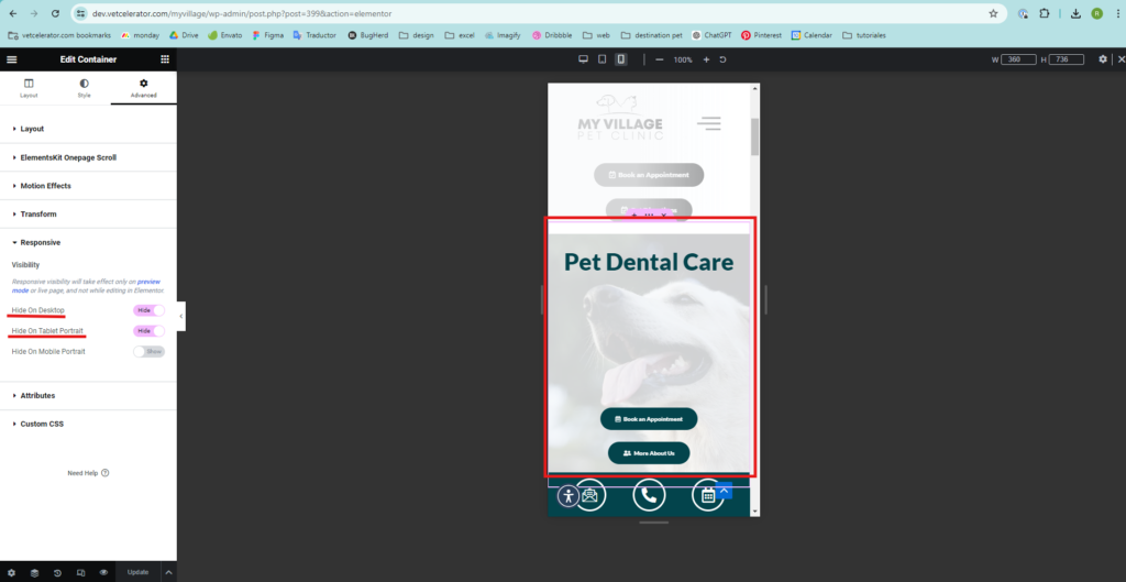
Understanding this, when making design changes, it’s necessary to hide certain elements or even entire containers for specific screen sizes. In Elementor, here’s how you do it:
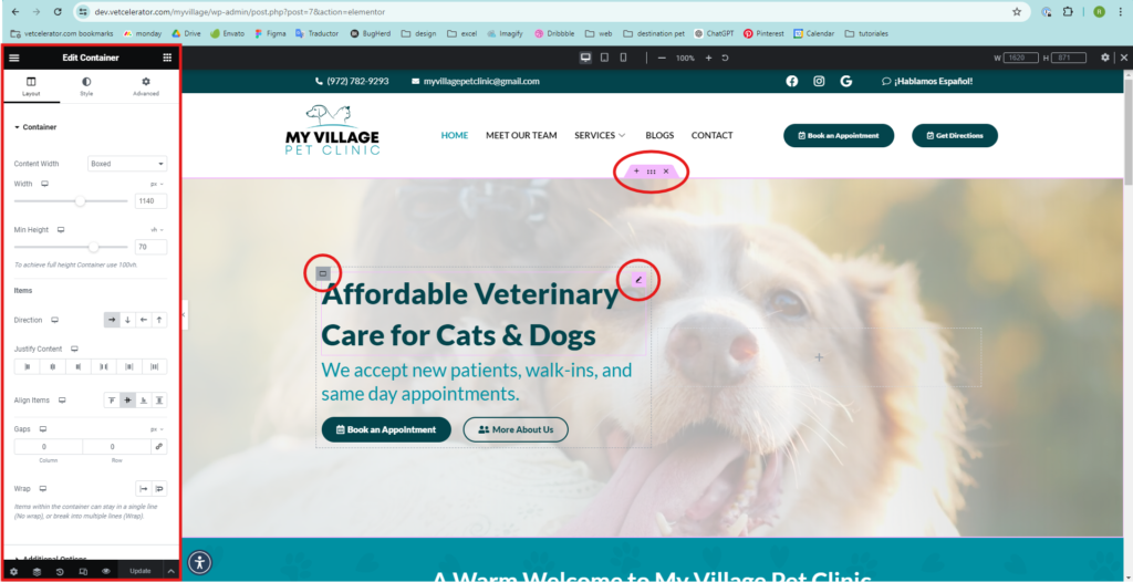
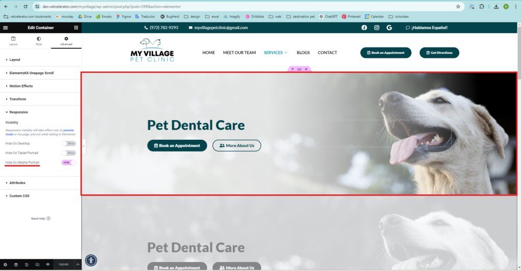
- Select the container or element you want to hide (select it from the icons that appear when you hover, and the editing menu will appear on the left).
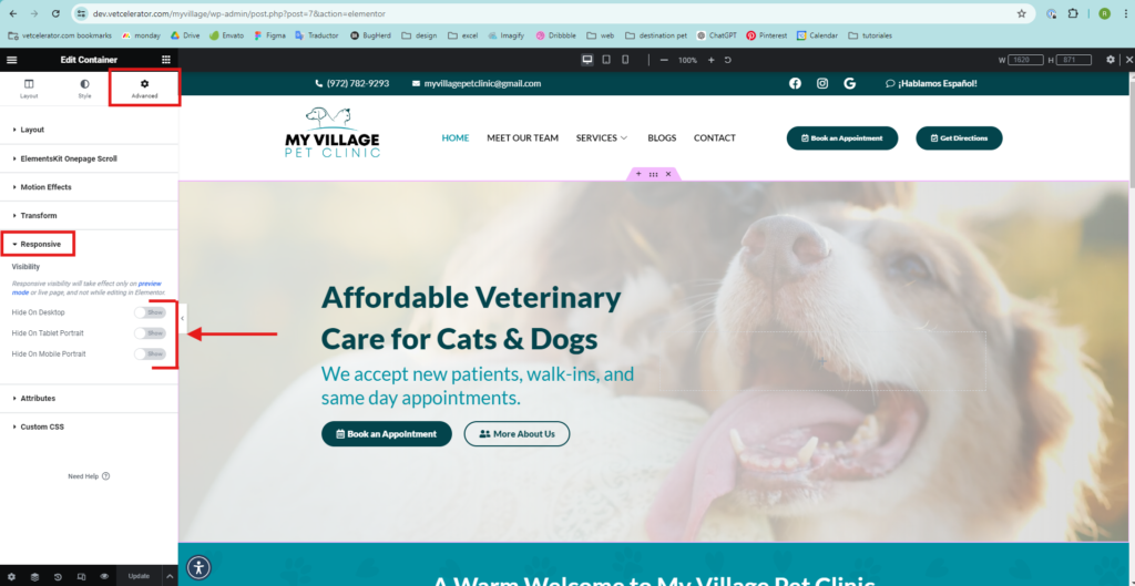
- At the top of the menu, click on “Advanced” and then on “Responsive.”
Activate the “Hide” option for the element you want to hide on a certain screen size.
In Elementor, when an element or container is hidden, it appears as follows:
The header for services on desktop and mobile is different; a distinct one was created for each while maintaining the design style.
DESKTOP
MOBILE