A webpage is viewed on various screen sizes, whether on a desktop, tablet, or mobile phone. In this article, you will learn how to visualize these different sizes in the various builders we use at Vetcelerator, as well as how to hide elements, images, or texts that do not fit the screen size.
Let’s start with Divi Builder.
- In Divi Builder, to view different screen sizes, click on the purple circle with three dots at the bottom of the screen. A menu will appear, and on the left side, you will see the screen icons.
As an example, images added to a webpage typically adjust to the screen size of the device they are viewed on. This is because images for mobile should be vertical or fit the mobile screen size, and another reason is to ensure that the arrangement of titles, texts, and images looks balanced in the design.
Understanding this, when making design changes, it is necessary to hide certain elements or even entire containers so that they are not visible on specific screen sizes. In Divi Builder, this is done as follows:
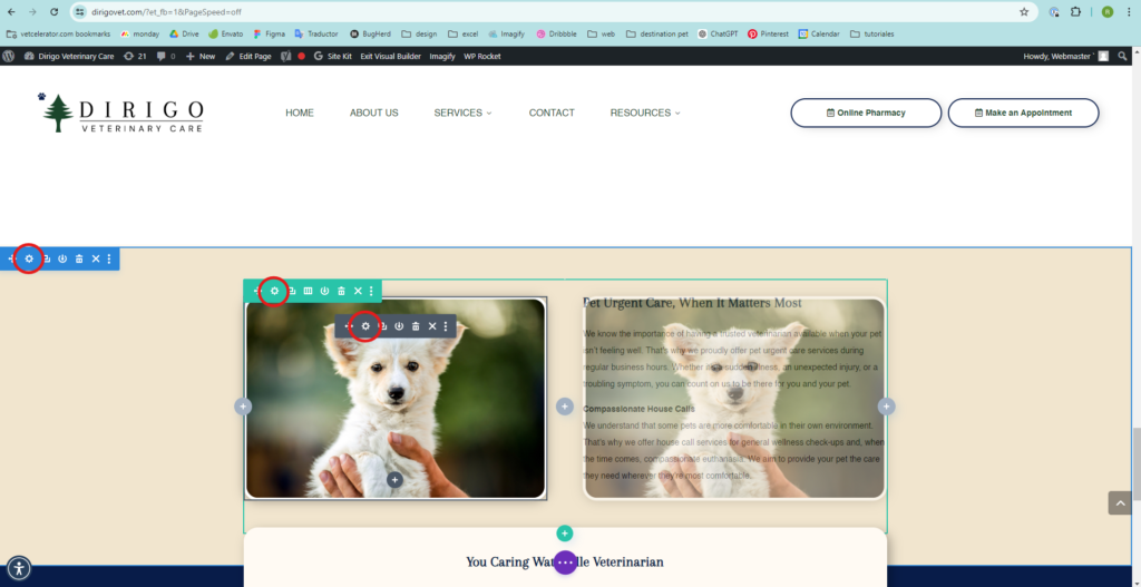
- To enter the Divi Builder editing menu, hover over the elements or containers you want to edit, and a line of icons will appear. Click on the gear icon to open the menu.
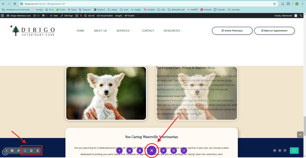
In this example, the image was duplicated because, when viewing the page on mobile devices, two images appeared together. The title, text, and image should be correctly aligned, and each image was hidden on the device where it didn’t work.
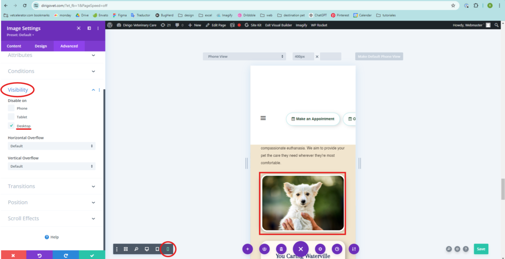
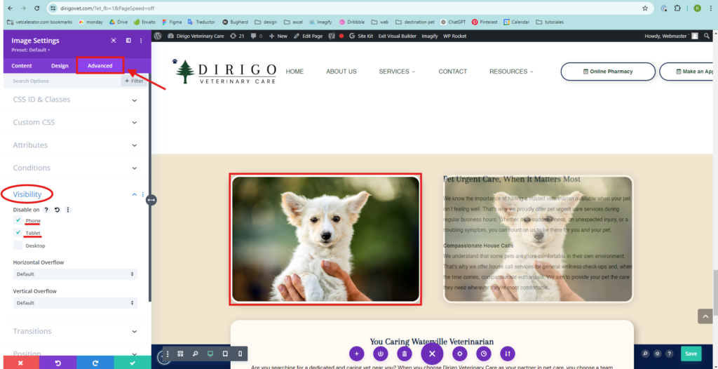
- In the menu on the left side, click on Advanced, then on Visibility, and activate the screen of the element or container that you do not want to be seen.
Desktop
Mobile