A website is used on various screen sizes, whether on desktop, tablet, or mobile. In this article, you will learn how to view these different sizes in the various builders we use at Vetcelerator, as well as how to hide elements, images, or text that do not fit the screen size.
Let’s start with Avada.
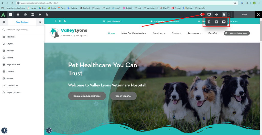
- In Avada, the screen size options are located in the top right corner. By clicking on the selected icon (you will usually find the desktop icon), the three screen size options will be displayed; choose the one you need.
For example, the headers of a webpage usually adapt to the screen size of the device they are viewed on. This is because a header designed for a desktop screen, which has more space, is generally not functional on a mobile device with a much smaller screen.
Understanding this, when making design changes, it is necessary to hide certain elements or even entire containers so they are not visible on certain screen sizes. In Avada, this is done as follows:
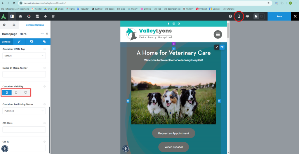
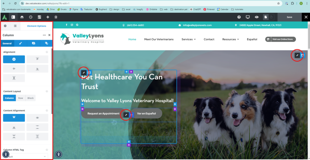
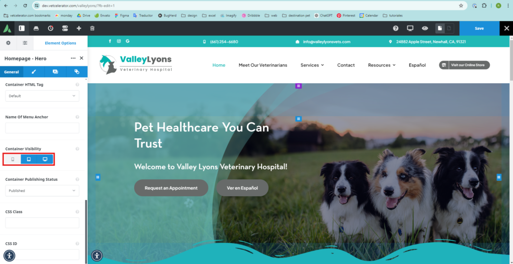
- Select the element or container you want to hide by hovering the cursor over the elements, and a pencil icon will appear. Click on it, and a menu will open on the left side for editing.
- In the first column on the left at the bottom is the Container Visibility option. Click on the icon of the screen you want to hide.
- In this example, the header is hidden for mobile.
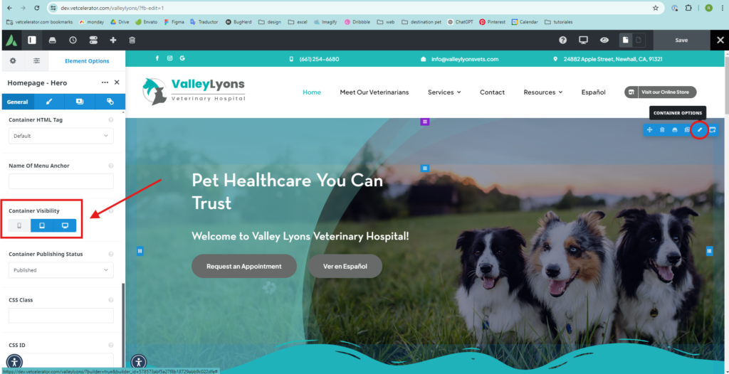
In Avada, hiding a container or element makes it disappear from the screen on which you hid it. In this case, a header was created for desktop and another for mobile.
Desktop
Mobile